Colour Contrasting
Choosing contrasting colours can define your room. There are different types of contrast. There’s contrast of light and dark colours, cold and warm colours, contrasting hues and contrast of saturation.
Choose your colour scheme by varying the brightness of your chosen colour. Darken the colour with black, or lighten them with white to create various shades for your colour palette.
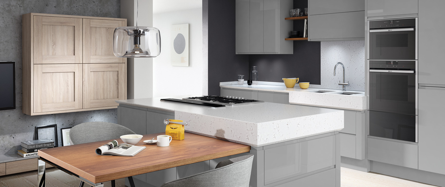
In the example below, the silver-grey Busby kitchen units have a contrasting bianco river work surface and splashbacks, as well as a dark grey wall. Subtle accent colours can be implemented in this type of colour scheme with the use of accessories and appliances.
If you have a preference to colours, such as reds, oranges and pinks then these are known as warm colours. These types of colours make a room feel cosy but make sure you counter the colour with lots of light, or you risk making the room too dark.
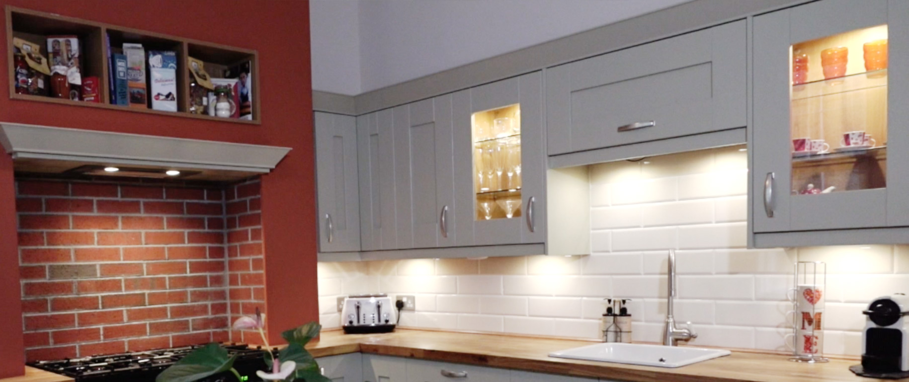
The kitchen below shows how a splash of colour, like a deep red can bring warmth to a room. The red brick adds to this and is a great contrast to the lighter colour units and white subway tiles.
Contrasting hues can vary and the further colours are from each other in the colour wheel, the greater the contrast. Examples of contrasting hues may be yellow and blue or green and red.
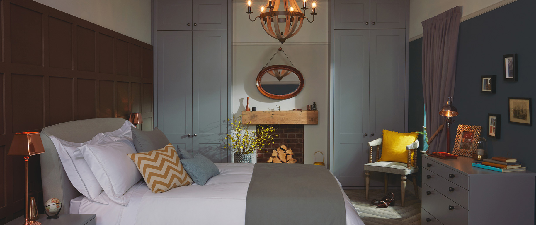
The Esker bedroom below shows a blue/yellow contrast. Items such as the cushions and lights create a subtle splash of colour.
The intensity of a colour may be referred to as the saturation. Using blacks, whites, or greys a colour can be subdued to create various shades.
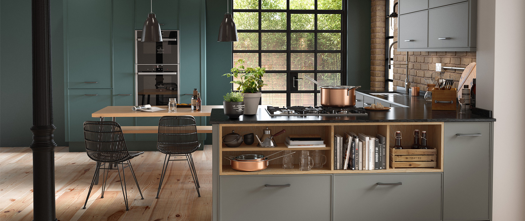
The open plan kitchen below is an example of this with different intensities of the colour green. The two units are shown in copse green and trench coat grey.
Need some help with choosing your kitchen, bathroom or bedroom colour scheme? Drop us a message on sales@dbrinteriors.com.